Iron Fist’s title sequence is as problematic as the show itself

If you were to play a game of spot the difference between the Marvel Cinematic Universe (MCU) and the studio’s TV shows with Netflix (sorry, Agents of SHIELD, you’re not part of this debate for reason’s that’ll become clear in a second), it wouldn’t really be a hard game to play. Everything from the size of the budgets, to the prestige of the cast, to being able to actually name other superheroes rather than referring to ‘the big green and the flag waver’ (see this Gizmodo article) differs between the two wings of Marvel’s output. But for the sake of this article, let me add one more item to the list that might otherwise be overlooked: the placement of the title sequences.
While the films of the MCU feature elaborate end credits (usually leading onto one of their famous teasers), coming after the film itself is over, the TV shows act like, well, TV shows, and have their credits sequence as the first thing on screen, save for a couple of cold opens. Agents of SHIELD just has a blink-and-you’ll-miss-it title card, so really, we’re talking about The Defenders here: Daredevil, Jessica Jones, Luke Cage, and Iron Fist.
Title sequences, wherever they’re placed, matter. It goes without saying really, but I’ve said it now. They’re an opportunity to tell the audience something about what they’re about to see, or what they’ve just seen. In the case of Tron: Legacy, that something might be ‘look at our fancy effects’ (to be fair, the fancy effects were the best part of that film), but generally, they’re meant to add some extra narrative. So, Game of Thrones gives us a tour of a miniature Westeros and Essos, True Detective floods the screen with evocative ‘American’ imagery, and Orange is the New Black cycles through ultra-close headshots of actual female prisoners (including Piper Kerman, whose memoir inspired the series.) In a nutshell, contemporary TV title sequences are the shows in a nutshell. So is it really a surprise that Iron Fist is quite so vacuous, when it has a title sequence that is just one extended image?
Through its first three shows, Marvel’s TV titles were sublime. Not only were they visually and audibly compelling – the viscous reds and thumping synths of Daredevil, the blurry watercolours and jazz of Jessica Jones, the sepia toned tribute to Harlem and 70’s beat of Luke Cage – but they set the scene perfectly. Over on the always-brilliant Art of the Title site, there are great interviews with the creative teams behind the Daredevil and Jessica Jones sequences, but really, you don’t need the interviews to see the meanings in the titles.
Daredevil’s titles cut from a shot of Murdock as he beats up Turk Barrett straight to the blind Lady Justice, scales and all, dripping in the blood-like liquid that features throughout the sequence. Straight away, the question that hangs over the entire series is posed: is it right for Matt to be judge, jury and executioner? The blood continues to drip over a rebuilding New York, reeling from ‘The Incident’. Jessica Jones’ sequence combines her professional voyeurism with the blurry uncertainty of her PTSD and Kilgrave. Luke Cage shows Cage with Harlem superimposed onto his back, the weight of the world on his shoulders. All three have distinct personalities, while casting Hell’s Kitchen as a character, retaining that grounding link that has been crucial to making the show work. They’re not set in a vacuum, in a world where the damage caused by the fight is secondary to ‘bringing down the villain’.
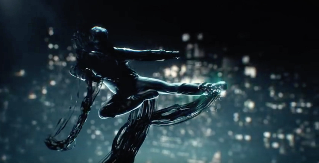
But Iron Fist’s sequence says the exact opposite; not only is it literally set in a semi-vacuum, but the meaning that can be drawn from it just reinforces all the problems with the show. The first half of the sequence shows ‘Ink Man’, as I have decided to call the central figure on account of his ooziness, set against the backdrop of nondescript mountains. One would imagine this to be the Himalayas, and therefore to represent K’un-Lun, but already, there’s a theme of vagueness developing. We’re not shown any particular imagery of K’un-Lun itself; no building or people or artefacts. Like the show, the titles shy away from a critical point in Danny’s life. We’re just shown what’s meant to be the Himalayas; all that seems to matter is that this is ‘the East’. That it doesn’t matter is the only conclusion one can really draw from the omission. Why else wouldn’t you show Danny coming of age?
Childhood and trauma play key roles in all four shows: Matt’s accident leads to his blindness, his powers, and his involvement with Stick; Jessica’s family tragedy leads her to live with Trish; Willis Stryker’s somewhat-unbelievable jealously of then-Carl Lucas leads to his vendetta against now-Luke Cage; and Danny’s plane crash, as orchestrated by Howard, leads him to K’un-Lun and to becoming the Iron Fist. The difference is that while the other three devote appropriate screen time to development through flashback, all we get from Iron Fist is to see him beaten as part of his training, and to see him once he has become the Iron Fist. All that matters is the violence and the title, rather than the culture, the lifestyle and to see Danny, the human, come of age, just as Danny, the hero, emerges. Indeed, the violence is really the only ‘action’ of the titles, though Ink Man doesn’t actually seem to be fighting anyone, he just seems to be showing off. But then Danny Rand, master of his emotions, would never be so cocky, would he?
The sequence’s transition to New York carries the same vague nature. It’s New York, but it’s postcard New York. It’s New York from a helicopter. It’s New York as seen in the flashbacks of 2013’s Oblivion. At best, it’s just meant to be a simple New York, a metropolis backdrop to the action. But at worst, it’s Danny Rand’s New York, the city as seen from the top floor of Rand Enterprises, looking down on the people below. Ink Man could’ve been shown on the ground, in amongst the crowds and communities of the city. Instead, he’s floating above a hazy array of skyscrapers and lights. You could argue that I’m reading too much into the image, but it’s still a choice for the image to be that way. Either it’s a result of total indifference to symbolism, or it’s malicious. The final shot is a wet dream for uber-gentrification, with not a single ‘small’ building in sight. Where the other three shows used their sequences to ground the action, Iron Fist seeks to fly into the vacuum. Perhaps the most amusing part of the sequence is that it foreshadows the conspicuous absence of the Iron Fist itself. The show spent more time hyping Danny’s power than actually allowing him to use it, and the titles almost seem to set us up for that disappointment. There’s a sort of punch move halfway through, but that’s the closest we get. You would think that a misty vacuum above New York would be the perfect place to show off your glowing fist thing, but apparently, it was too difficult even for the title sequence. There’s space for countless random fighting moves, but not for the title power of the show.
And what is any of it actually meant to mean, anyway? I’ve tried to break down the visible symbolism, but that says nothing to the intent behind the sequence. It’s highly possible it’s just meant to be ‘cool’ and ‘oriental’, given that’s the tone of the show overall, but surely there’s meant to be more to it than that? What was the guidance given to the creative team behind the sequence? ‘Throw in some mountains to represent the East’. ‘Make him look kick-ass’. ‘Don’t show his power cause we’re not using it much and we don’t want people to be disappointed’. There’s really nothing more than that in the sequence. It’s just a minute of Ink Man kicking the air and leaving a mess. That’s it. And it doesn’t even seem to look like Danny. It just seems shocking that the level of detail that went into the first three sequences would give way to something so empty and bland.
But then, it seems shocking that the level of detail that went into Daredevil, Jessica Jones and Luke Cage would give way to something like Iron Fist. But it did, and it was crap, and I’ve written far too many words to talk about the 1-minute clip at the start of each episode. Still, we now have the release date for The Defenders, so things are on the up.


